The Magical World of Apps
Photos by Forrest Anderson, iPhone Mockups by Froispat on Favpng and Zee Que, Designbolts.com
When my husband Forrest Anderson tells people he’s an app developer, they sometimes look at him blankly and then start talking to him about property development. This despite statistics indicating that more than 3 billion people in the world use mobile phones and their apps.
Mobile apps increasingly make the world go round. We use them to communicate with each other, read, shop, order food, book travel arrangements, find answers to our questions and a host of other daily functions. Because they are so pervasive, it’s hard to remember how recent and amazing a phenomenon they are and to understand the immensely complex process by which an app gets to the App Store.
In the 1990s, J.K. Rowling envisioned in her books about the magical world of the young wizard Harry Potter a beaded bag into which books, a tent and all kinds of other useful objects could be shrunk and carried about. Today's smartphones give us similar magical powers. Stereo systems, telephones, televisions, projectors, department stores and supermarkets, musical instruments, movie theaters, camera systems and businesses that would have once taken up miles and miles of space now reside so comfortably in our pockets (or even on our wrists) that we don’t think twice about them. That is, unless we are app designers and developers. To be a developer or designer of apps is to walk, think, eat and dream in the labyinthine world that lies under the hood of those tiny rounded rectangles that reside on your iPhone.
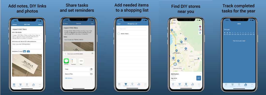
My husband and I were reminded of this when we recently launched a major update to our productivity app for iOS, Home Gnome. The concept of the app is simple. it provides a monthly list of home maintenance tasks – changing HVAC filters, checking the batteries in smoke detectors, adding salt to the water softener, maintaining the automatic garage door opener – that home owners can do in a few minutes to keep their homes in tip top shape. They can track their annual progress in the stats section, add items they need to a shopping cart and check the in-app map for home improvement stores near them where they can purchase the items on their shopping cart. They can customize their monthly tasks, add, delete and sort them, add DIY video and other links, notes and photos and share them via email or text message. They can add them to other to-do list apps or set reminders for them.
Sounds simple doesn’t it? But here’s the complex story of how the app came to be.
The Idea
Like most apps, this one began as a vague feeling of discomfort about a problem. We had just built the third house we have owned. Our first one wasn't in great shape when we bought it and although we made many improvements, we never totally got on top of maintaining it by the time we sold it. We had the second one built new but unfinished, so most of our efforts on that house went into finishing it. When we sold both houses, we not surprisingly had to spend several thousand dollars on home improvements that we could have prevented had we maintained them better. The problem was that we weren't clear what should be done when to keep our home maintained. With the third house, we were determined to create a system to do so as efficiently as possible. Like most homeowners, maintenance is far from our favorite chore and a major goal was to keep the time spent on maintenance to a minimum so we had time to enjoy our weekends after a busy work week.
Research
Accordingly, the app (then unnamed) began with extensive research on the Internet, stacks of DIY books hauled home from the library and the manuals that had come with all of our appliances and home systems from the furnace and HVAC to the garage door opener. The research was eye opening. As I plowed through it, I compiled a calendar of home maintenance tasks that had to be done on a regular basis to keep a home in good shape and prevent damage from neglect.
I made to-do lists for each month, then tested the time they would take to complete. With the exception of a couple of times a year when deep cleaning and other annual tasks like paint retouching was needed, the tasks typically took only a few minutes per month. That was good news. However, the research also made me aware that some maintenance tasks were seasonal. That meant that they needed to be done at a different time in the southern hemisphere than in the northern, adding to the underlying complexity of the app. We had to have a way for the tasks to appear in the right months for users in both hemispheres.
I also checked competitors’ apps to see if we could improve on what had been done before. There were few apps in the home maintenance field, and the ones that existed had a different focus than our planned app had, so we could forge ahead freely.
Vision
After this research, we wrote a basic vision for the app. We decided that its audience would be the average homeowner, it would be produced at least initially in English, and the focus would be on preventing unnecessary repairs with good maintenance. We want to make what could be a dull chore fun, so we needed a colorful interface, a playful logo and marketing tools that encouraged participation by family members of all ages. We wanted it affordable and settled on the $2.99 price as one that anyone could afford, especially if the alternative was several thousand dollars worth of preventable repairs annually. To test the market and get feedback, we placed a very simple 1.0 version of the app on the app store. When we got a positive response, we decided to move ahead with a full-featured upgrade.
Sprint
We then held what is called in the design world a Sprint. This is an intensive, one-week process in which we hashed out the basic concept using post-it notes, created diagrams showing the connection between parts of the app, and created a working prototype that allowed us to test the app on an actual phone.
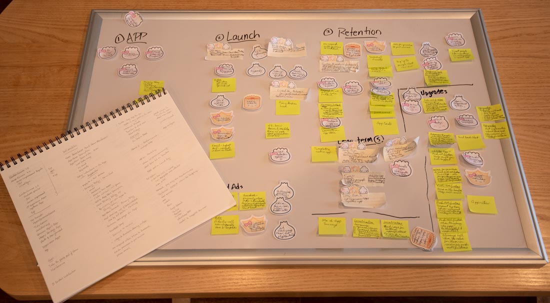
The app began visually as Post-it notes organized on a white board during our one-week Sprint session. We ran out of regular Post-it notes midstream and the only ones on hand were shaped like Chinese dumplings so that's what we used.
This prototyping process needs to consider a wide variety of constraints and contexts in which people will use an app. Buttons and links must be large and distinct enough so people can use their thumbs to tap on them without accidentally tapping on other elements. Their devices should be able to switch to dark mode when needed so they can be used at night and in low light. This isn’t necessary for all apps such as the one that we just finished, but our next app does require this feature because it will be used in various lighting conditions. That means that two versions of all colors, text and other elements in the app must be designed so the app will be usable in conditions that require dark mode.
In creating a prototype, designers make potential users the focus of their efforts. Mobile devices are often used in short spurts as users stand in line in a supermarket, check their emails between meetings, play a game or shop on their lunch break. They must be able to manipulate a phone with one hand. They must be able to interrupt their use of an app and come back to it later to pick up where they were before. Designers assume that app users are going to have short attention spans, so they design apps that allow them to do tasks quickly. Designers sometimes visit places where apps are likely to be used to check out the conditions and design for them. It’s a fascinating journey into the intersection between digital technology and the physical world, with surprises along the way.
App development also requires living within the constraints and opportunities of the tiny computers that we call smartphones. They run on batteries and have less powerful processors than desktop computers, but also have cameras and can detect your location. App developers must develop for a wide array of screen sizes, hardware specifications and app configuration. Our app was designed for four sizes of iPhones and two versions of the iOS operating system.
This can require multiple designs and testing of the prototype on different phones, tablets, and desktop computers. The designer must know the peculiarities of the devices the app will be viewed on. They must adjust the size of text, graphics, buttons, links and other features to the way that users will interact with specific devices.
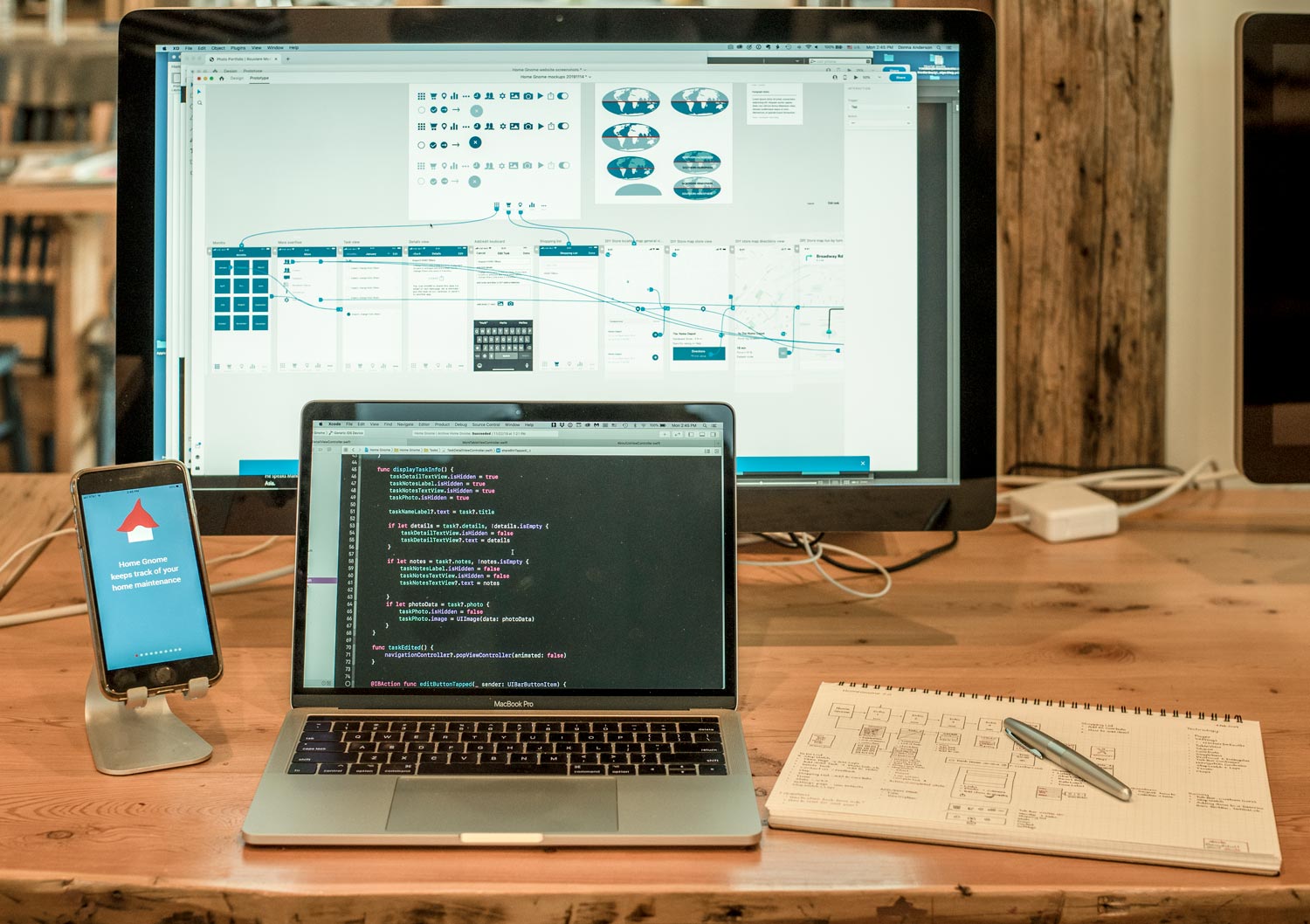
We created our prototype in Adobe software called XD, which enabled us to create a working simulation of what the final app will be like. We also chose a name for the app that helped determine its character and the icon that would be seen on the phone. It initially was named House Mouse and had a mouse icon, but we changed it to Home Gnome when we found that the name House Mouse was already that of another app in the App Store. Within a week of intense work, we had a working prototype that Forrest could use to build the code behind the app.
Build
Working from the designs for each page, Forrest made drawings of each individual scene's underlying functionality so he could get his head around how he needed to build its architecture. He then extracted from the prototype the graphic elements, which in this case mainly included icons and buttons. Using a coding program for iOS called Xcode, he created the scenes in storyboards to link the visual elements with computer code. He then created a database with all of the data about the home maintenance tasks in it. He wrote code to connect the data with the visual elements so that they would display and change properly as the user touched them. It was a highly involved process to connect everything and get it working properly under all circumstances, made more complicated because the user can input their own data that is stored on their phone. A small element such as adding or editing a new home maintenance task could require many lines of code. The app, as simple as it looked, had hundreds of moving parts that had to be linked and tested repeatedly until they worked. The App Store has stringent guidelines for developers that govern how apps function on different devices, all of which a developer must keep in mind.
Major concerns in app development are security that protects the privacy of users in an era of aggressive hacking while providing remote services in a timely manner. There is always a tug-o’-war between protecting privacy and data and limiting the irritation users feel at being asked to provide passwords and emails. The designers’ and developers’ job is to minimize that pain.
Forrest also frequently consulted with helpful developers at a weekly meeting of iOS developers called NSCoders. Two of them, Austin Blaser and Cole Joplin, were especilly helpful in working through coding challenges. As a whole, the app developer community has a reputation for cooperation that has grown out of the complex nature of developing apps.
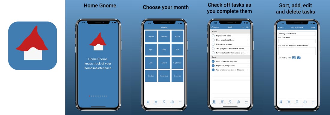
Above and below, screenshots of the functions and views in the apps.
Marketing
While Forrest was writing the code, I worked on the marketing. Much of the marketing of an app occurs inside it with the way it is organized. I created an introductory animation that shows new users how the app works. I designed a companion website (in three sizes for the desktop, tablet and phone) that showcases the app, created Youtube promotional and tutorial videos about the app and business pages and materials for social media ranging from Twitter, Facebook, Instagram and Pinterest to professional venues such as LinkedIn and Behance. In all, I created marketing materials for the app using ten types of software – XD, Illustrator, Photoshop, Indesign, Premiere, After Effects, OmniGraffle, OmniOutliner and Word. To meet our marketing deadlines, I moved between the different software at a dizzying pace that gave me design vertigo. Amid this work, I occasionally redid app designs as our vision changed, we streamlined the app and we found that it wasn’t possible or advisable to create some of the functions that we had envisioned.
I also pored over and refined legal agreements protecting the privacy of app users and spelling out the app’s legal terms of service.
Polishing and testing
Forrest and I then rejoined forces to polish and refine the app before putting a beta version of it out in the developer world for testing. A number of developers generously tested the app and responded with helpful feedback, launching another round of polishing before the app was uploaded to the App Store for approval. Forrest also built, tested and polished the companion website, which included the Youtube videos about the app, a support page, and several other pages.
Launch campaign
With the app approved by the App Store, we quickly launched marketing campaigns on Twitter, Facebook, Instagram and Pinterest as well as posting news of the app’s release on LinkedIn and updating our resumes to incorporate its release. We sent messages announcing the app to popular Internet influencers in the areas of home maintenance and improvement and iOS apps.
Retention
No one creates an app to get it done. App development is a journey, and the day after an app hits the App Store, designers and developers begin to plan for upgrades large and small in its features. Despite extensive testing before apps are launched, unexpected feedback from users can require changes to both designs and codes. All of these are placed on a development schedule along with the marketing that will accompany each of them.
Evaluation
The next step is to go through all of the materials used in the app and make sure that they are in organized files so they can be drawn upon for use in future versions of the app. From this also emerges updated templates and workflows reflecting what we learned on this app that we can use in our next app. While we were creating this app, Apple was barreling ahead with technological advances in their phones and a new version of Swift, the code language that we used to build this phone. Our next app will be built with the new version. Updates in design software also will be incorporated into future projects.
Because apps are so ubiquitous and easy to use, most of us forget that they are computer programs that run on a sophisticated miniature computer.
A handheld mobile radio telephone was envisioned as early as 1917. This led to the early predecessors of cell phones – analog radio communications from ships and trains. After World War II, advances in mobile telephone technology continued but were very expensive. The first handheld mobile phone call was made from Motorola to Bell Labs in 1973, on a 9 x 13-inch slab of a device much thicker than today’s tablets. It weighed 2½ pounds.
Steve Jobs as early as 1983 envisioned a store in which software could be downloaded over phone lines. The next year, the first handheld cellular mobile phone, the Motorola Dynatec 8000X, became available commercially.
Early mobile phones were pretty terrible. You could make only 30 minutes of phone calls a day because they had short battery life and had to be charged for more than ten hours. There were serious network range issues so you could only make a few calls in your area. Nonetheless, they transformed a number of industries.
The first smartphone - the IBM Simon - was launched in 1994. It came pre-loaded with several “features” that essentially were apps – an address book, calculator, calendar, mail, note app and sketch pad.
In 2002, the Blackberry 5810 integrated wireless email. Various phones also had small arcade games, the ability to change ring tones, to-do lists, calendars and other features that we call apps today.
In June 2007, Apple released its first iPhone. It was a game changer. Alongside the clunky half-keyboard, half-screen configuration of other phones, its sleekness and ability to touch the screen were stunning. It came pre-loaded with apps such as maps, photos, text and Weather, but that was it. By today’s standards it was primitive. It took another three years before Apple added the ability to cut, copy and paste. It couldn’t send photos. There was no ability to record video nor Siri. Then Apple introduced an iPhone software development kit for third-party app developers. This led to the July 2008 launch of Apple’s App Store, with 500 apps. A stunning 10 million copies of apps were downloaded in three days and the word “app” became the Word of the Year in 2010.
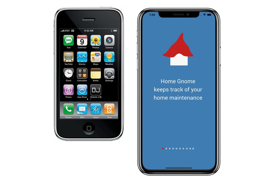
An early iPhone 3GS and a current iPhone 11. The early iPhones had few features compared to today's phones, but were sleek, had stunningly beautiful skewmorphic icons and established Apple as the leader in smartphone technology.
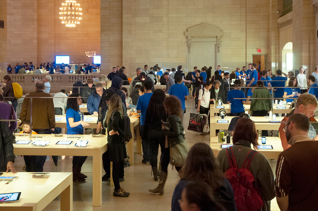
Apple became an ecosystem with sophisticated, high-end packaging of the kind that had once characterized high-end department store products, a whole new type of retailing, genius bars, retail employees that met you at the door and sold you a phone from their iPads and Apple stores located in famous historic buildings.
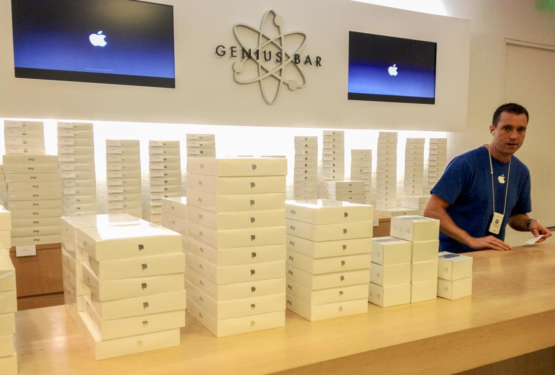
Stacks of iPads in their boxes on the counter of the Genius Bar in an Apple Store in Raleigh, North Carolina.
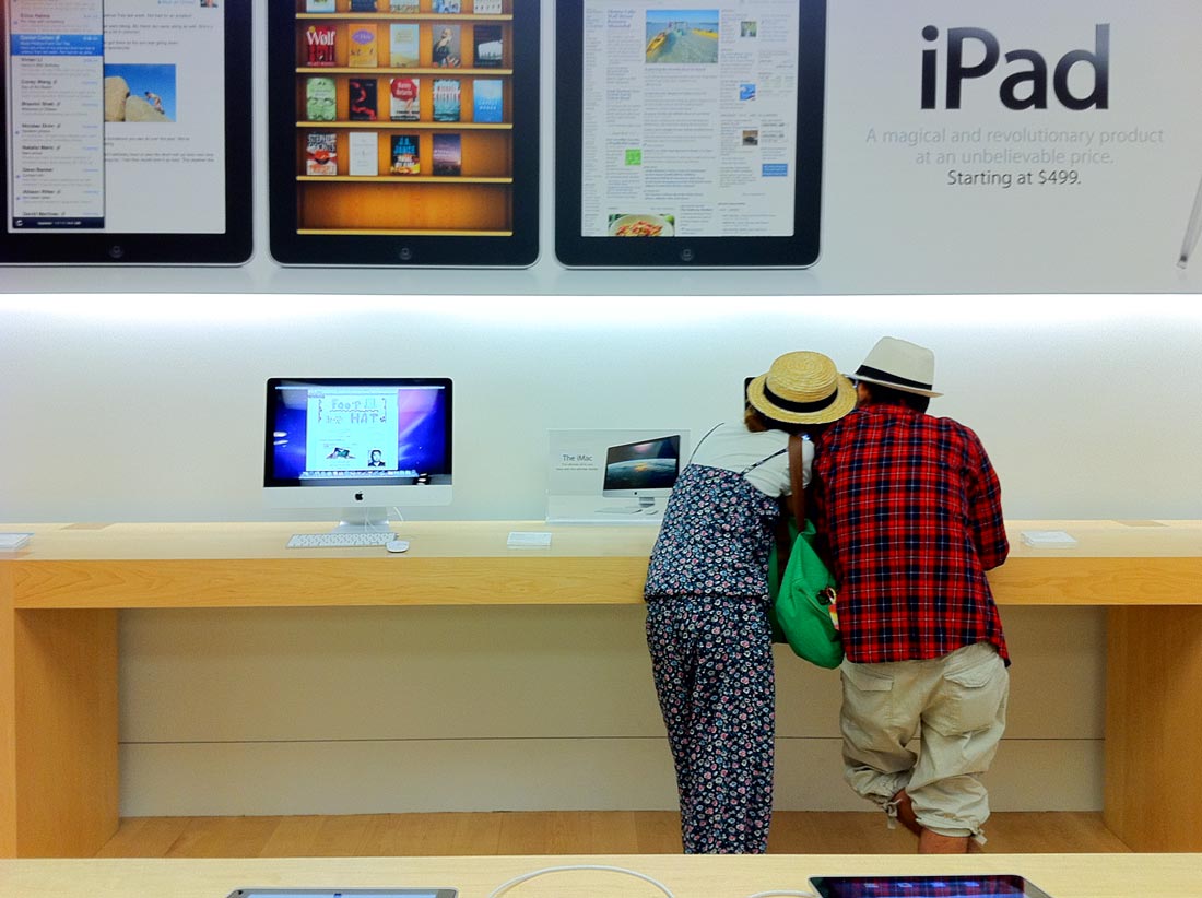
Apple Stores became cool hangouts. A couple in an Apple Store in Durham, North Carolina.
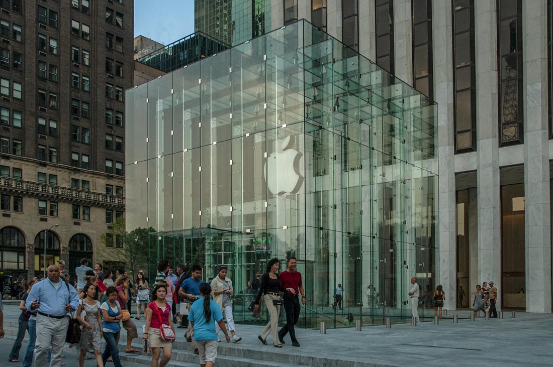
The iconic glass cube Apple Store in Manhattan, New York, and, below, the Apple Store in Grand Central Station, New York.
Google followed in 2012 with Google Play for Android phones, rebranding its Android Market, Google Music, Google Books and video into a single marketplace.
App stores are typically operated by the owner of a mobile operating system, such as the Apple App Store, Google Play or Windows. Large networks of app developers have built up around these stores and their operating systems. For apps with a price, generally 20-30 percent of revenue goes to the store and the rest to an app’s producer. The same app therefore can cost a different price depending on its mobile operating system.
The app stores have spawned huge networks of developers with an on-going relationship with the store of their chosen operating system as well as specialty services such as controlling security risks when employees of a company are allowed to work on their own devices. Instead of controlling their entire computer and work environment, apps are used to create isolated, secure work pockets outside of personal data. This enables employees to work anywhere and a company’s data to be secure. Developers can control who gets access to data and apps and how files can be shared. These apps can be either web apps with “wrappers” designed to protect them or native apps, which are more flexible.
Three types of apps have emerged, each of which have advantages:
Native apps are those that run on a particular mobile platform such as Apple or Android. They typically perform better, are consistent and constitute a better user experience than the other types.
Hybrid apps are a mix of native and web-based technology. They have the advantage of supporting web and native technologies across multiple platforms. They are easier and faster to develop than native apps, but don’t perform as well.
Web-based apps are coded in web languages such as HTML5, CSS or JavaScript. The user has to have Internet access for them to perform well. They save on memory space and allow users to fetch data on any device from the Internet.
The explosion in number and variety of apps made discovering them a challenge which in turn has led to creation of review, recommendation and curation blogs, magazines and on-line app lists. Government regulatory agencies started trying to regulate and curate apps, especially medical apps, in 2014 to protect consumers.
By around 2014, more people were using apps than were browsing the web. Apps became the train that all of our high-tech gear including tablets and personal computers ran on.
Apps developed cult followings. Remember Draw Something, the Pictionary-inspired game that 1 million users in nine days, Candy Crush Saga and the ubiquitous Angry Birds that got its own merchandise and movie?
Social media flowered in the phone environment as Facebook, Snapchat and Instagram became household features. Apps started adding to their revenue with ads and in-app purchases.
Then apps went onto our wrists, with smart watches that have helped countless people monitor their health and saved lives.
Now we control our home and sprinkler systems, lights and home security with apps. We use them for eating, drinking, exercising, and a wide variety of work. They have gone via tablets and phones into pilots’ cockpits, hospitals, schools, dentist offices, police cars, banks and other businesses. Hair dressers began to bill using iPhones.
Tech entrepreneurs became the most influential people in business.
The smartphone helped transform developing countries such as China, in which it was a rare and expensive privilege to own a land-line telephone in the 1980s. China pretty much skipped the land-line phase altogether in favor of mobile phones.
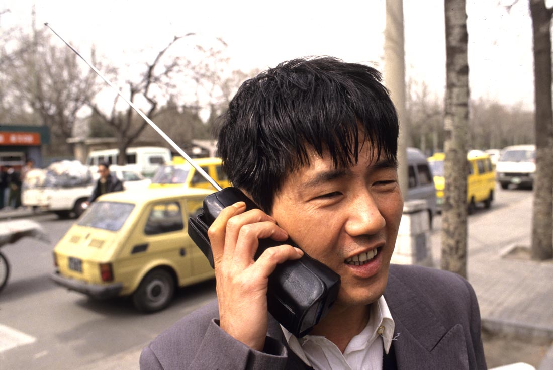
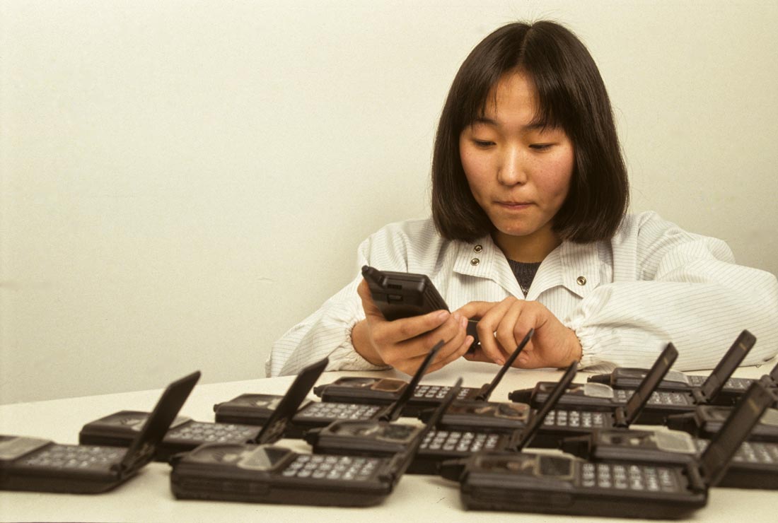
Above, an early mobile phone user in Beijing, China, and below, a Motorola employee testing phones in Tianjin, China, in the 1990s.
China now has three times the number of mobile phone users as the United States and India is close behind China. Segments of the Chinese app industry have become more sophisticated than the American market at integrating apps into efficient systems and in app-based banking and payments, partly because Chinese society is far less concerned about protecting individual privacy rights than Westerners are. Among the most controversial aspects of China’s app industry has been the use of invasive surveillance apps by China’s police and security, monitoring and censorship of social media networks which are popular apps and the government’s strong-armed insistence that people download and use a propaganda app about top leader Xi Jinping’s activities and pronouncements. Apps also have been politicized as they have been used to mobilize protesters in various locations, most prominently during this year’s unrest in Hong Kong.
By 2015, the Google Play and Apple stores were generating $5 billion and millions of jobs had been created in the industry. App developers created more than 200 billion apps in 2018 and about 700 million apps are downloaded daily.
The most popular downloads are communication ones and games, followed by business, education and lifestyle. The top app by downloads is Facebook Messenger, with Facebook next.
The size of the mobile app market is projected to hit $189 billion by next year. Mobile apps have transformed advertising, becoming its dominant growth factor. Mobile apps have much higher engagement rates than websites do and 100-300 percent higher rates of conversion so investing in a useful app can provide businesses with substantial long-term benefits.
Just one percent of app publishers generate 92 percent of App Store revenue, but the picture changes when taking into account the large number of free apps that connect to businesses that make money through them. More than 40 percent of small businesses have their own app and consider them important to their businesses.
App usage is growing worldwide, with many users opening a single app dozens of times a day. Almost 98 percent of app users use communication and social apps and web browsers, and 95 percent use utilities and tools. Other popular categories are shopping, news and weather, travel and finance.
Almost half of all smartphone users use apps mostly to communicate with their friends and acquaintances. Music, multimedia and games also are popular pastimes that use apps.
About half of smartphone users open apps more than 10 times daily, with eight percent doing so more than 50 times. The average user uses 30 apps in a month. People ages 18-44 spend more than half of their digital time in mobile apps, while the percentage goes up in the 18-24 age bracket. Millennials in particular are avid app users who are always on the lookout for new apps and wish they could do more with them. Apps often are their go-to place when they are bored. The average smartphone user in the United States spent 3 hours each day in apps in 2018, and the amount of time continues to go up between 10-20 percent per year.
Initially, apps were intended to help people with basic productivity tasks - email, calendar and contact databases, but there now is an app for virtually any activity - tracking the weather, the stock market, doing yoga and other workouts, travel, factory automation, army logistics, maps, banking, order tracking, ticket purchases.
There also are useless or esoteric apps that calculate how high your phone goes when you throw it up in the air, blow enough air out of your phone’s speakers to extinguish a candle, enable you to brag about your wealth, allow you to get fake phone calls when you need to get out of an awkward situation, hide contact phone numbers from people you’re mad at until you have time to cool off, track ghosts near you, analyze your baby’s cry and recommend what it wants, and test your patience.
App designers’ goal is to emulate in apps the traditional conversations by which many actions were accomplished in pre-digital days, but to do so wherever and whenever users want to talk. One of the first questions a designer asks when starting to design an app is “What conversation are we having?” A skillful designer can create the impression that even such bothersome interactions as providing a password or one’s location are all part of a conversation with a kind, helpful facilitator. For many people, this approach is so successful that they become personally very attached to their phones. Such apps help make phones people’s ultimate loyal ever-present personal assistant. Many designers pour the best of their personalities into app designs, anticipating users’ needs and going way beyond them to satisfy. The apps simulate a thoughtful unobtrusive person who corrects our spelling in such a way that it doesn’t annoy us, anticipates what hotel we would like to book based on our past preferences and keeps track of our schedule. We reward them by taking them everywhere – to work, church, driving, sports events, holiday celebrations, traveling. Forty-four percent of us even sleep next to our phones. Ninety-five percent relax with them just before bed, and immediately check them if they wake up during the night or in the morning.
The more we customize our phones, the more they become like us, except nicer because they edit out the socks designers and developers leave under their beds, the impatience they feel in the real world and the fact that they would never allow another person to rearrange their furniture in the way they allow their apps' users to customize parts of the apps.
As we use these personal assistants that we call smartphones, they become smarter and smarter, more able to anticipate and respond to what we need. Thus our conversations with our phones become more useful to us, and we spend more time with them. Unlike our human acquaintances, we can customize our phones to an astonishing degree – tossing apps as we lose interest in them, upgrading ones we love and replacing phones with ones that work better.
For people who struggle with interacting with the real world because of disabilities, this helpfulness and patience has been a godsend.
For designers and developers, apps are a place where we can become the awesomely kind and helpful people that we want to be in the real world but often fail at becoming. We can scale up the kindness by making an app available to many people without placing an extra burden on ourselves. Plus we can get paid for our effort. It’s win-win niceness.
Because as users we all can customize our phones, we can create a little village in them consisting of our home’s systems, our map apps, our church, school, bank, gym and grocery store’s app, and a folder for apps pertaining to our work. We can communicate with people we love without the effort of going to see them or inviting them for dinner. Our phones are a way for us to create a safe small town world within our confusing urbanized world of strip malls randomly vying for our attention. People are hard-wired to rely for survival on close relationships with small trusted and cooperative networks of family and friends, an advantage that smartphones help provide.
The ubiquitous relationship between people and their smartphones has been much maligned by psychologists because it can make the real people in our lives feel ignored, annoyed or pushed away.
When you can download an app that can help solve a problem instantly, it can be harder to work through a problem with another human being who may not be so accommodating. More than 70 percent of women in one study reported that mobile phones interfered with their marital relationships. Many phone users are rightly seen as rude and inattentive and studies have indicated that conversations without phones present tend to be significantly higher quality than those where phones are present.
At the same time, smartphones are popular because they provide immense benefits in various aspects of our lives and provide us with a convenient route to connecting with others.
Studies indicate that the happiest people are those who have the ability to both use their phones to connect and to put them away and connect with real people. Hmm, probably there’s an app that helps us do that….
Check out these related items
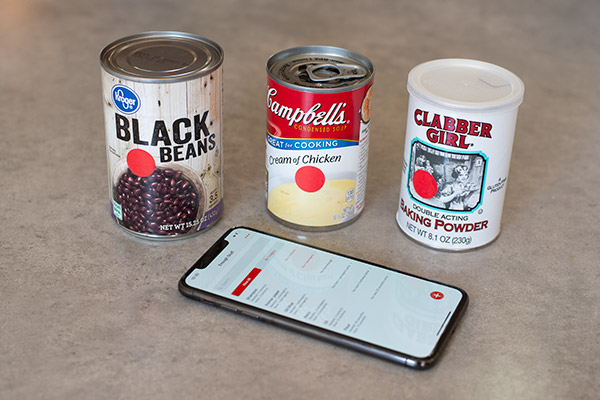
Inventory App and Sticker Dots
Use sticker dots and an easy inventory app, Enough Stuff, to keep track of your food supplies, toiletries and other stuff of all kinds.
New iPad Pro is a Game Changer
Apple's new iPad Pro has transformed personal organization and design. It's a combination command center and mobile design studio.
Easy Home Maintenance App
Two home owners created the Home Gnome app to track when to do home maintenance tasks. The iOS app is available at the App Store.

Green Thumbometer
Gardening can be a good way to relieve stress and get fresh air during the coronavirus shutdown. Here are a new tool and tips.
When Simplicity is a Necessity
Simplicity is a necessity for disabled people. The accessible design of some great products exemplifies this characteristic.

Calendars - The Way We Keep Time
Our calendar system evolved over thousands of years and is continuing to do so with electronic calendars and globalization.
